Misrepresentation
Data science ethics
TIME coverage
How plausible is the statement in the title of this article?

LA Times coverage
What does “research shows” mean?

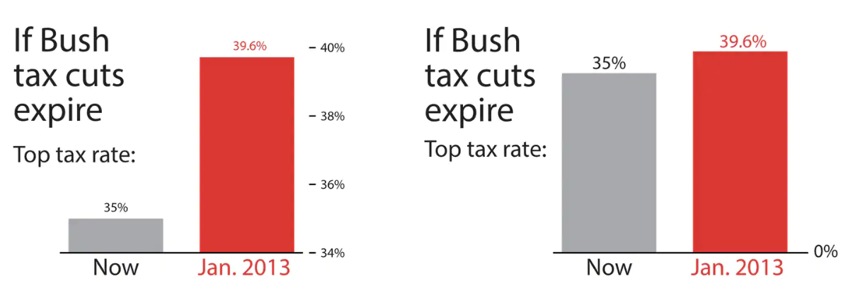
Tax cuts
What is the difference between these two pictures? Which presents a better way to represent these data?
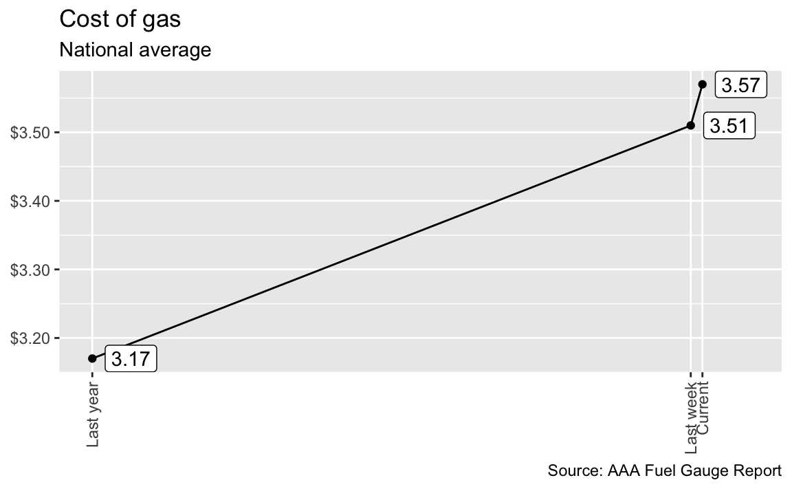
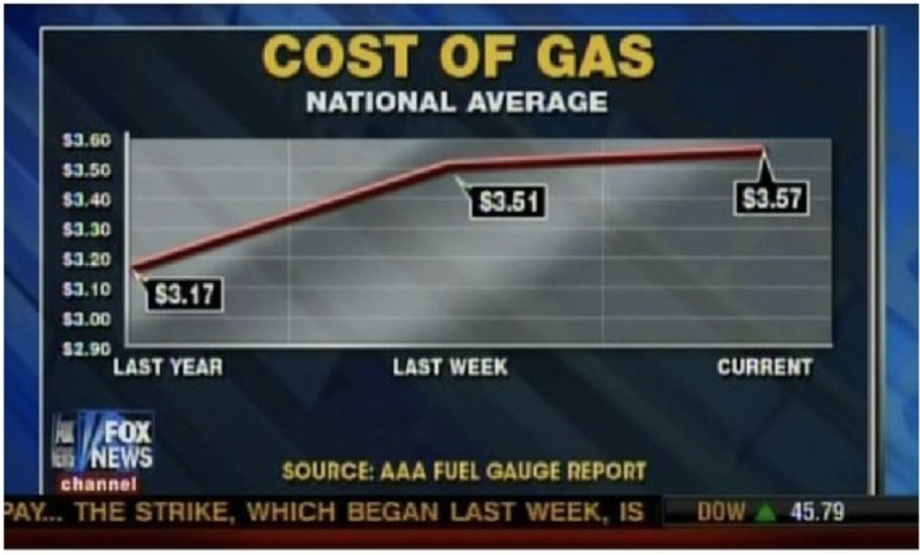
Cost of gas
What is wrong with this picture? How would you correct it?
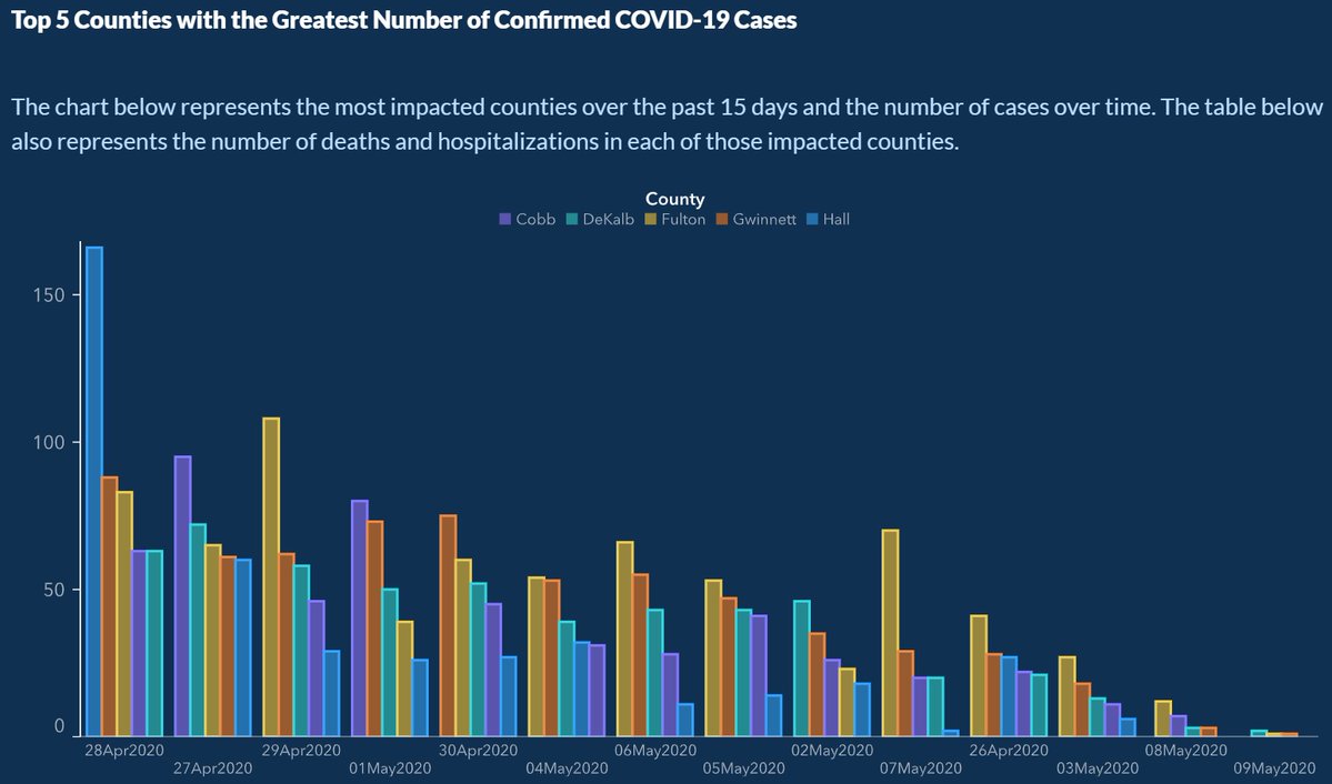
COVID in GA
What is wrong with this picture? How would you correct it?
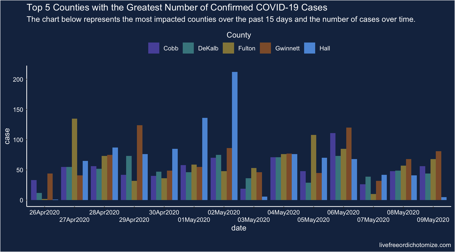
COVID in GA
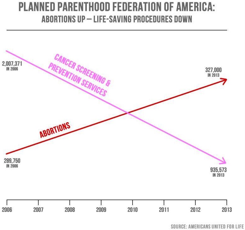
PP services
What is wrong with this picture? How would you correct it?
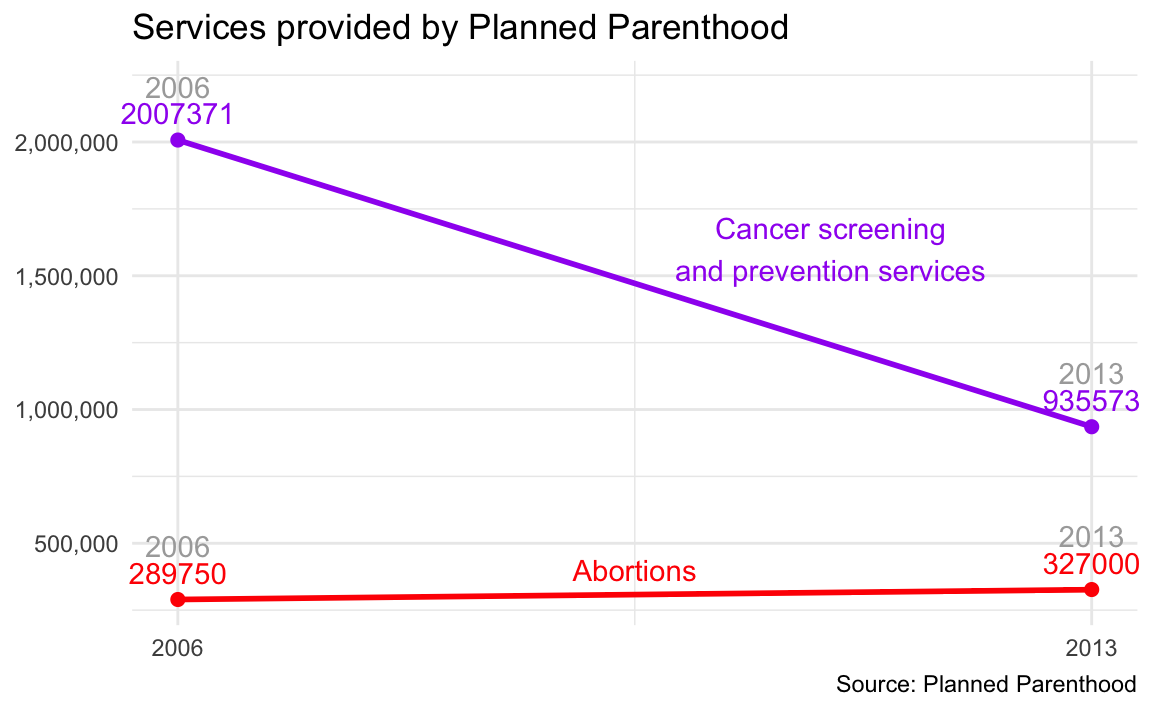
PP services
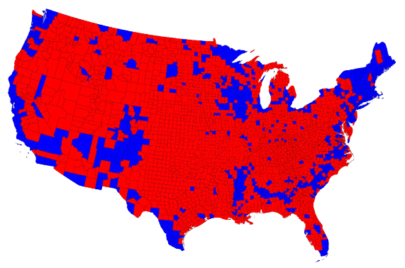
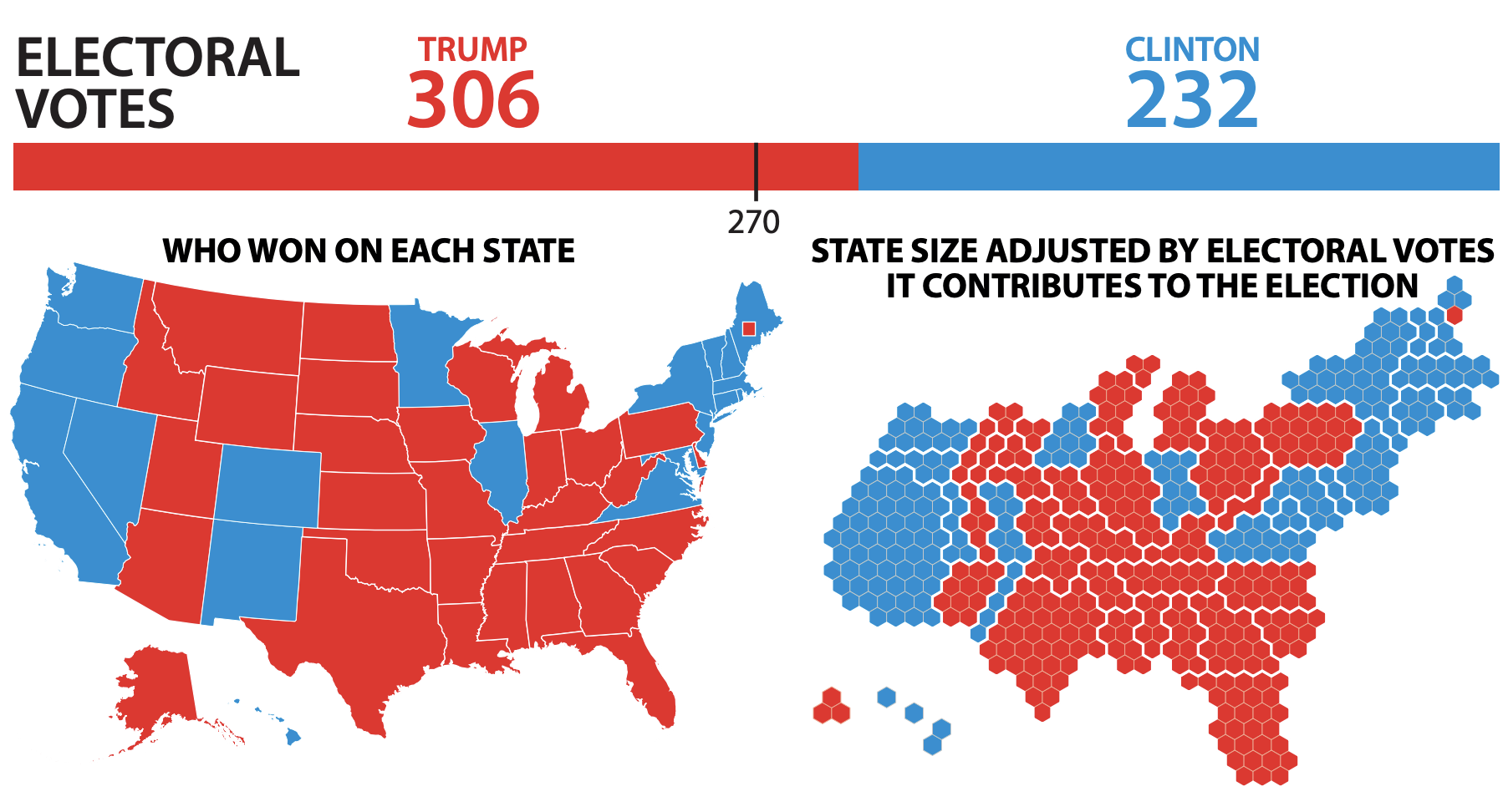
Voting map
Do you recognize this map? What does it show?
Two alternate tales


Voting percentages
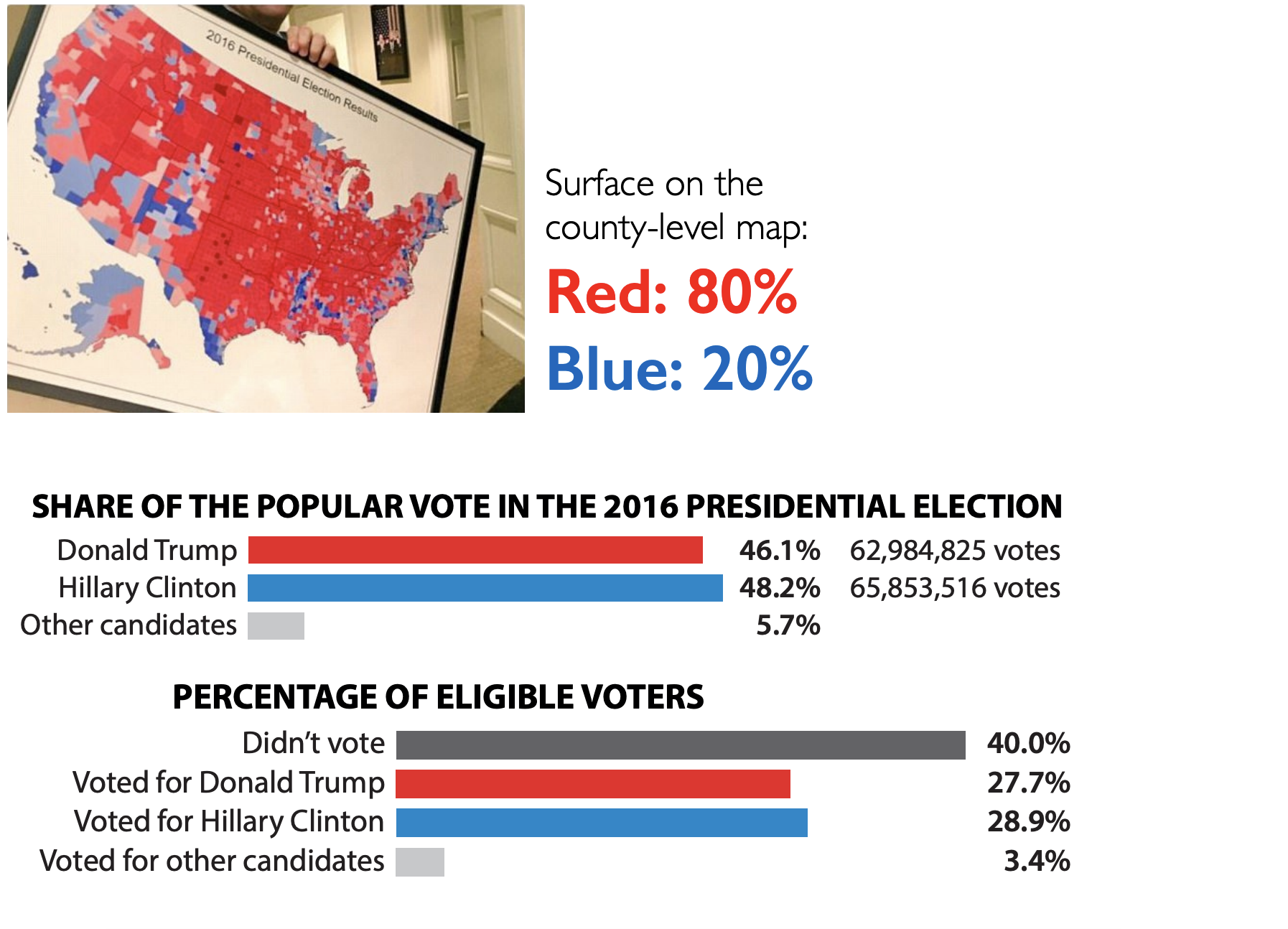
Voting percentages
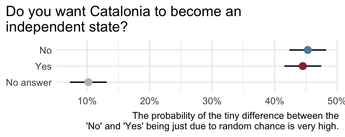
Catalan independence
On December 19, 2014, the front page of Spanish national newspaper El País read “Catalan public opinion swings toward ‘no’ for independence, says survey”.
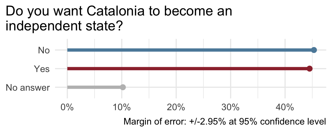
Catalan independence
How Charts Lie
Calling Bullshit
Calling Bullshit
The Art of Skepticism in a
Data-Driven World
by Carl Bergstrom and Jevin West