library(tidyverse)
library(scales)Halving CO2 emissions (Complete)
Introduction
Visitors to Gapminder.org are welcomed with a question about common misconceptions. Here is one of them.
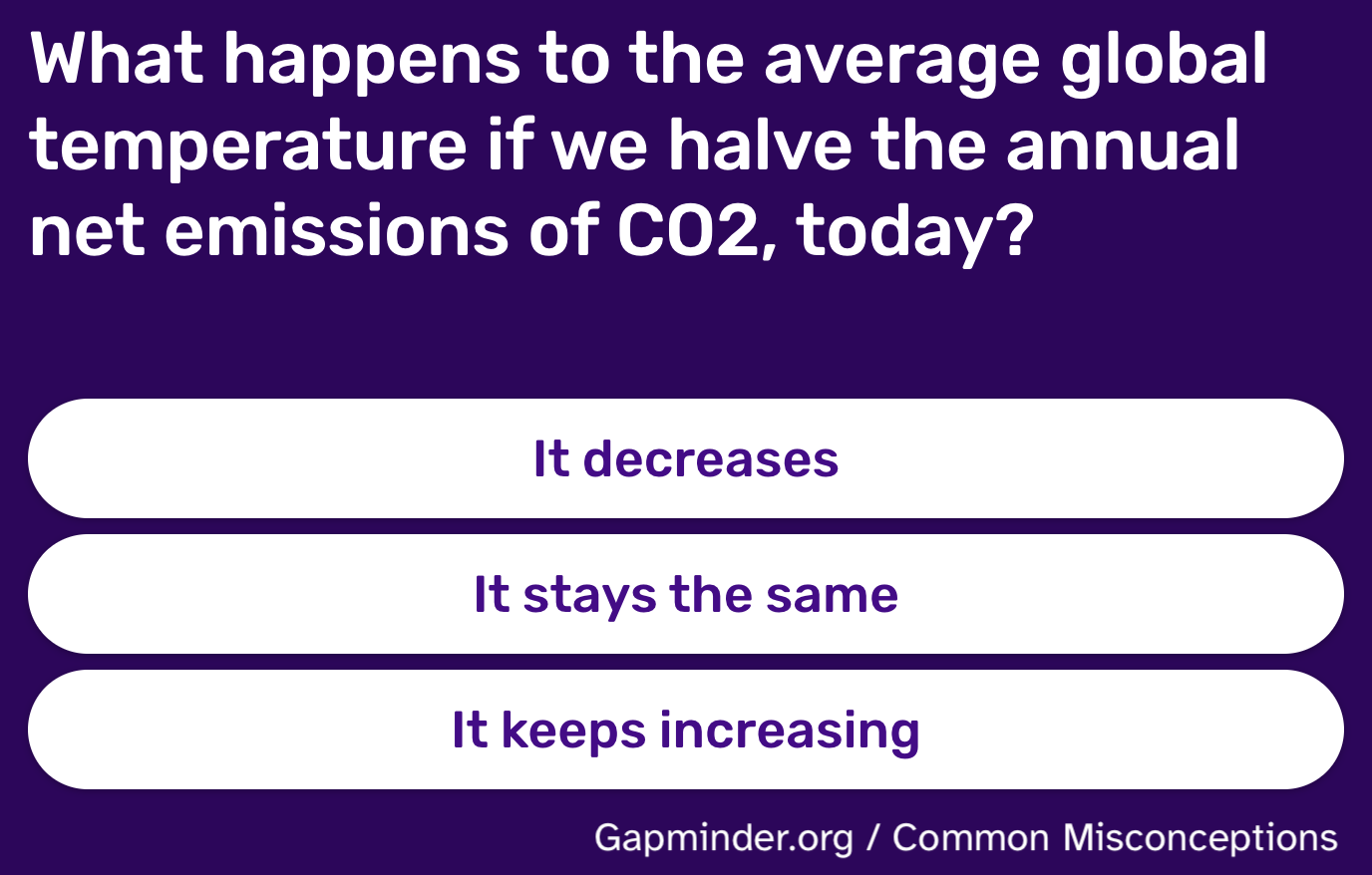
Once you make your selection, you are directed to a page that explains the right answer and shows a visualization of the distribution of responses from various countries.
Our goal is to create a version of this visualization.
Packages
We will use the tidyverse and scales packages for data wrangling and visualization.
Data
The data we’re going to use is in a CSV file called co2-emissions.csv at https://data-science-with-r.github.io/data/co2-emissions.csv.
co2_emissions <- read_csv("https://data-science-with-r.github.io/data/co2-emissions.csv")Rows: 8 Columns: 4
── Column specification ────────────────────────────────────────────────────────
Delimiter: ","
chr (1): country
dbl (3): Very wrong, Wrong, Correct
ℹ Use `spec()` to retrieve the full column specification for this data.
ℹ Specify the column types or set `show_col_types = FALSE` to quiet this message.And let’s take a look at the data.
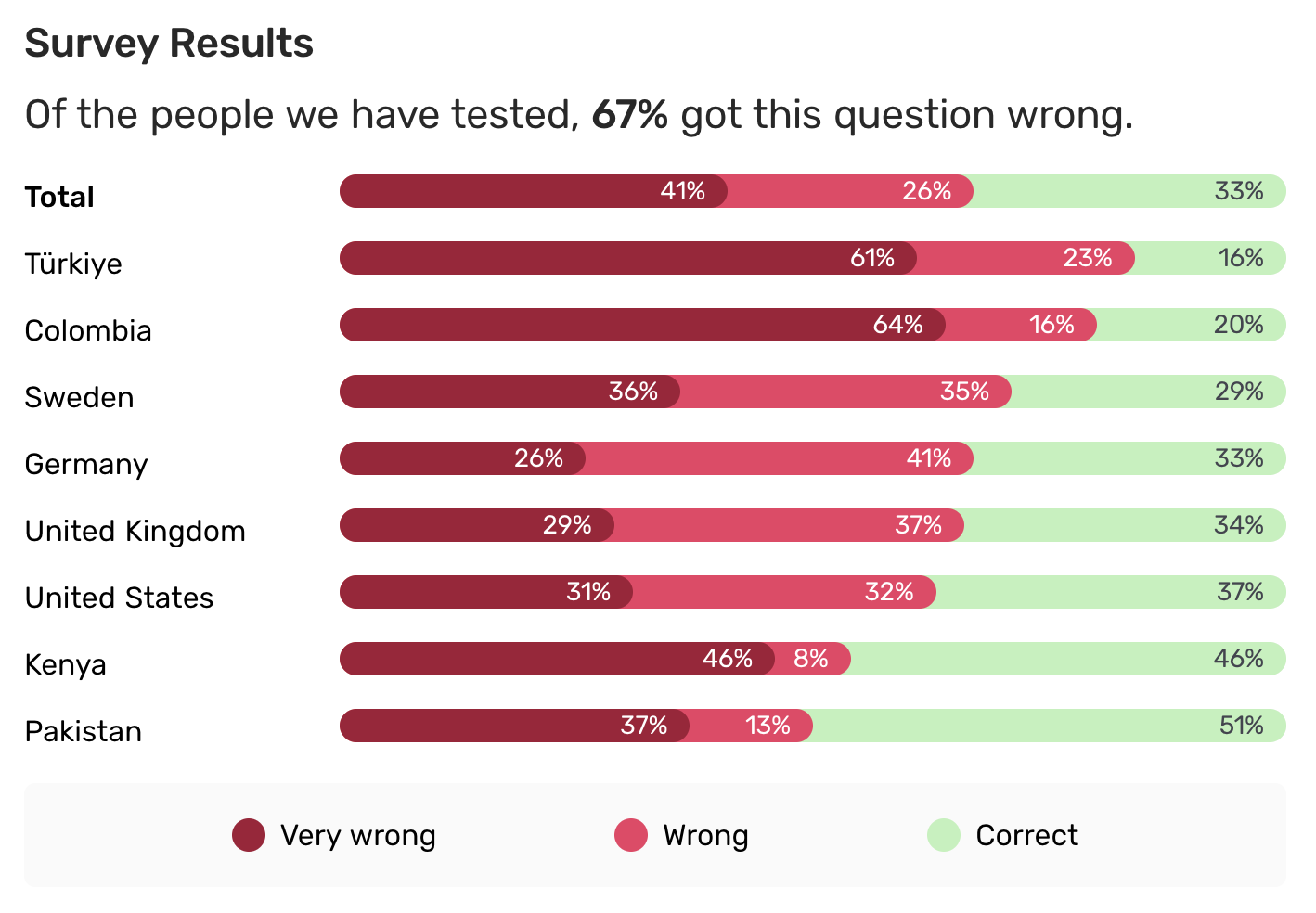
co2_emissions# A tibble: 8 × 4
country `Very wrong` Wrong Correct
<chr> <dbl> <dbl> <dbl>
1 Türkiye 61 23 16
2 Columbia 64 16 20
3 Sweden 36 35 29
4 Germany 26 41 33
5 United Kingdom 29 37 34
6 United States 31 32 37
7 Kenya 46 8 46
8 Pakistan 37 13 50Analysis
- Pivot the
co2_emissionsdata frame longer such that each row represents a country / answer type combination andanswer_typeandpercentagefor that country are columns in the data frame.
co2_emissions_longer <- co2_emissions |>
  pivot_longer(
    cols = !country,
    names_to = "answer_type",
    values_to = "percentage"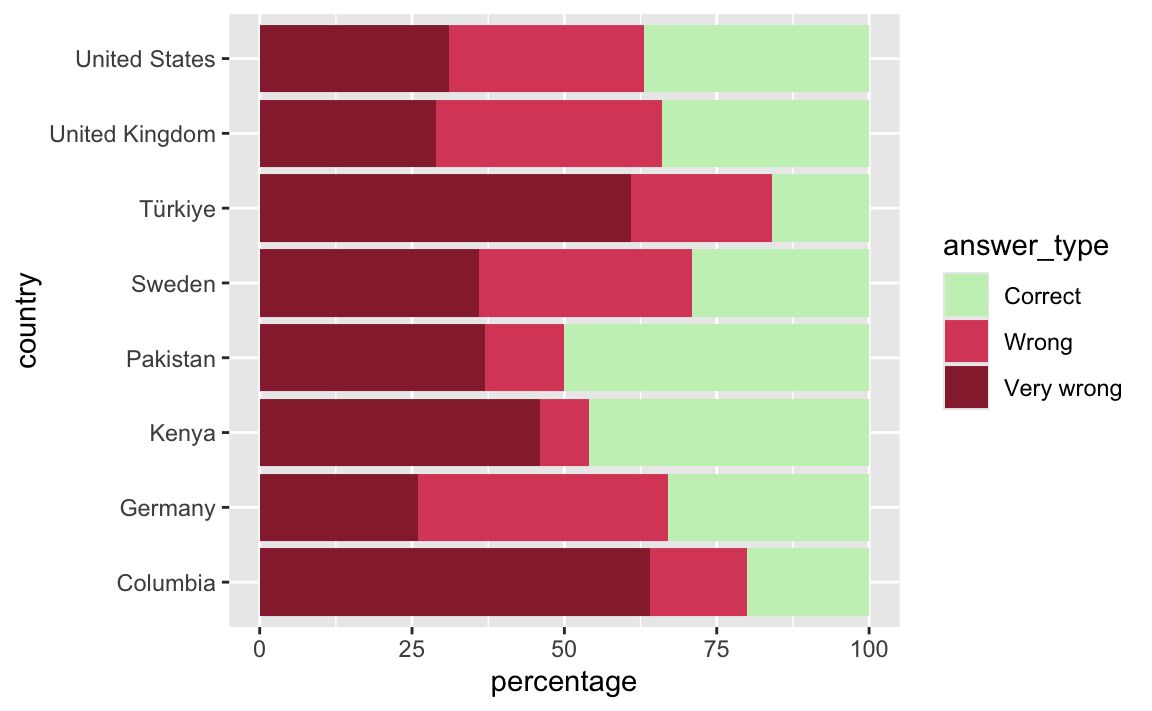
)- Create a stacked bar plot of response type by countries.
ggplot(co2_emissions_longer, aes(x = percentage, y = country, fill = answer_type)) +
  geom_col()
- In the original plot, the levels of
answer_typeare in the order Very wrong, Wrong, and Correct. Update the previous plot reorder the levels in this order.
co2_emissions_longer |>
  mutate(answer_type = fct_rev(fct_relevel(answer_type, "Very wrong", "Wrong", "Correct"))) |>
  ggplot(aes(x = percentage, y = country, fill = answer_type)) +
  geom_col()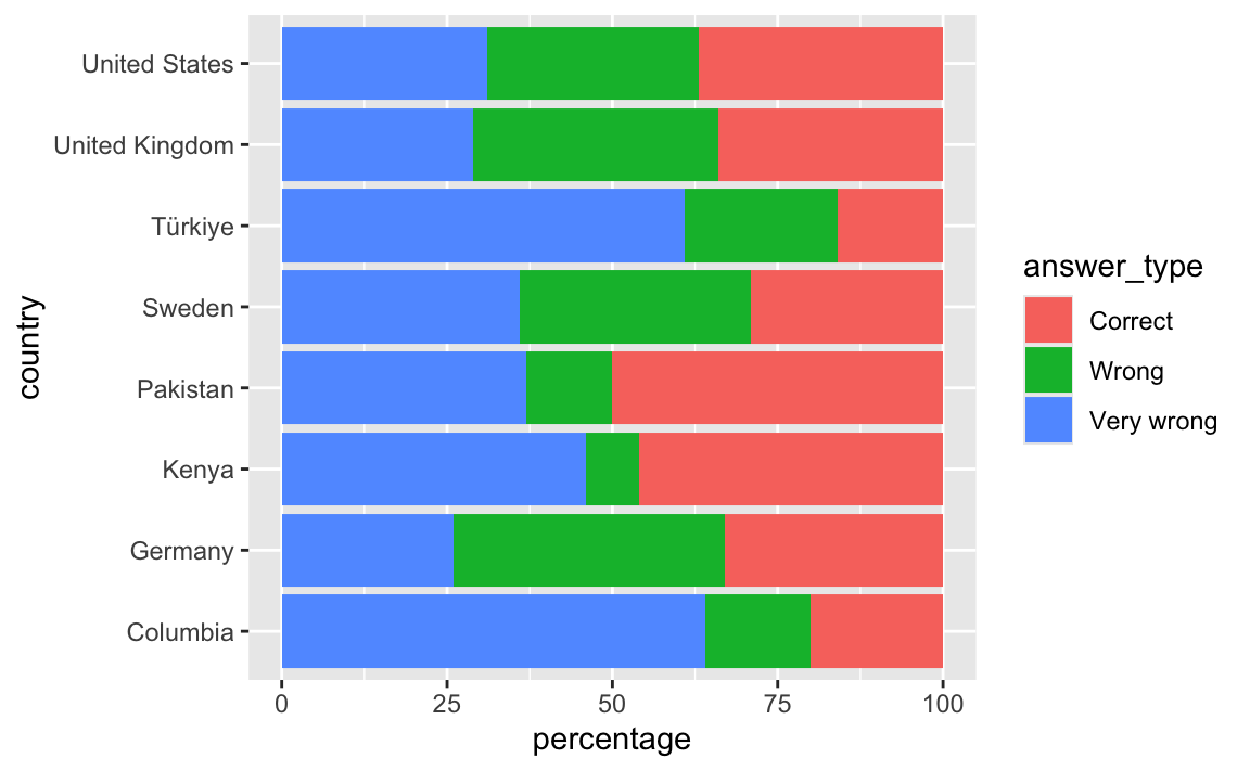
- Update the colors of the plot to match the original plot:
- Very wrong: #96283A
- Wrong: #DB4C67
- Correct: #C8F0BF
co2_emissions_longer |>
  mutate(answer_type = fct_rev(fct_relevel(answer_type, "Very wrong", "Wrong", "Correct"))) |>
  ggplot(aes(x = percentage, y = country, fill = answer_type)) +
  geom_col() +
  scale_fill_manual(
    values = c(
      "Very wrong" = "#96283A",
      "Wrong" = "#DB4C67",
      "Correct" = "#C8F0BF"
    )
  )
- Move the legend to the bottom and make sure the levels appear in the same order they appear in the plot.
co2_emissions_longer |>
  mutate(answer_type = fct_rev(fct_relevel(answer_type, "Very wrong", "Wrong", "Correct"))) |>
  ggplot(aes(x = percentage, y = country, fill = answer_type)) +
  geom_col() +
  scale_fill_manual(
    values = c(
      "Very wrong" = "#96283A",
      "Wrong" = "#DB4C67",
      "Correct" = "#C8F0BF"
    ),
    guide = guide_legend(reverse = TRUE)
  ) +
  theme(legend.position = "bottom")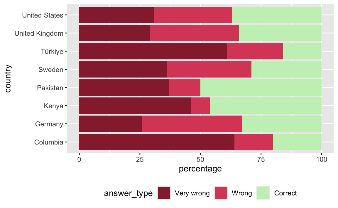
- Reorder countries to match the original plot – in increasing order of corect percentages.
co2_emissions_longer |>
  mutate(
    answer_type = fct_rev(fct_relevel(answer_type, "Very wrong", "Wrong", "Correct")),
    country = fct_rev(fct_relevel(country, "Türkiye", "Columbia", "Sweden", "Germany", "United Kingdom", "United States", "Kenya", "Pakistan"))
  ) |>
  ggplot(aes(x = percentage, y = country, fill = answer_type)) +
  geom_col() +
  scale_fill_manual(
    values = c(
      "Very wrong" = "#96283A",
      "Wrong" = "#DB4C67",
      "Correct" = "#C8F0BF"
    ),
    guide = guide_legend(reverse = TRUE)
  ) +
  theme(legend.position = "bottom")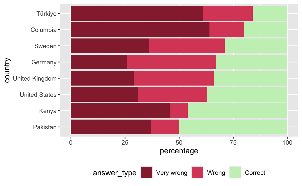
- Update labels and other elements of the plot to get it closer to the original plot.
co2_emissions_longer |>
  mutate(
    answer_type = fct_relevel(answer_type, "Correct", "Wrong", "Very wrong"),
    country = fct_rev(fct_relevel(country, "Türkiye", "Columbia", "Sweden", "Germany", "United Kingdom", "United States", "Kenya", "Pakistan"))
  ) |>
  ggplot(aes(x = percentage, y = country, fill = answer_type)) +
  geom_col() +
  scale_fill_manual(
    values = c(
      "Very wrong" = "#96283A",
      "Wrong" = "#DB4C67",
      "Correct" = "#C8F0BF"
    ),
    guide = guide_legend(reverse = TRUE)
  ) +
  scale_x_continuous(labels = label_percent(scale = 1)) +
  theme_minimal() +
  theme(legend.position = "bottom") +
  labs(
    fill = NULL,
    title = "Survey Results",
    subtitle = "Of the people we have tested, 67% got this question wrong.",
    x = NULL, y = NULL
  )