Mario games + data visualization
Data visualization and transformation
Data Science with R
Please reference the Meet the toolkit: Programming exercises for information and instructions on how to interact with the programming exercise below.
Getting started
Please run the following code by clicking the green arrow just above the code chunk. When reading in the data, nothing will appear after you click the button. However, clicking the arrow ensures that your data are read in and can be used for the following programming exercise.
In this mini analysis we work with the data from the openintro package in R. These data are auction data from Ebay for the game Mario Kart for the Nintendo Wii, collected in October 2009. A key to these data can be found below:
| variable name | description |
| id | Auction ID assigned by Ebay. |
| duration | Auction length, in days |
| n_bids | Number of bids |
| cond | Game condition, either new or used |
| start_pr | Start price of the auction |
| ship_pr | Shipping price |
| total_pr | Total price, which equals the auction price plus the shipping price |
| ship_sp | Shipping speed or method |
| seller_rate | The seller’s rating on Ebay. This is the number of positive ratings minus the number of negative ratings for the seller |
| stock_photo | Whether the auction feature photo was a stock photo or not, either yes or no |
| wheels | Number of Wii wheels included in the auction. These are steering wheel attachments to make it seem as though you are actually driving in the game. |
| title | The title of the auctions |
Packages
We’ll use tidyverse for the majority of the analysis and scales for pretty plot labels later on. ggridges allows us to make ridge plots, and gridExtra allows to arrange plots next to each other. These are ready to use for you in this programming exercise!
Get to know the data
We can use glimpse() to get an overview (or “glimpse”) of the data. Write the following code below to accomplish this task.
With your output, confirm that:
There are 143 rows
There are 12 variables (columns) in the dataset
If you receive the error Error: object ‘mario’ not found, go back and read in your data above.
glimpse(mario)Rows: 143
Columns: 12
$ id <dbl> 150377422259, 260483376854, 320432342985, 280405224677, 17…
$ duration <dbl> 3, 7, 3, 3, 1, 3, 1, 1, 3, 7, 1, 1, 1, 1, 7, 7, 3, 3, 1, 7…
$ n_bids <dbl> 20, 13, 16, 18, 20, 19, 13, 15, 29, 8, 15, 15, 13, 16, 6, …
$ cond <chr> "new", "used", "new", "new", "new", "new", "used", "new", …
$ start_pr <dbl> 0.99, 0.99, 0.99, 0.99, 0.01, 0.99, 0.01, 1.00, 0.99, 19.9…
$ ship_pr <dbl> 4.00, 3.99, 3.50, 0.00, 0.00, 4.00, 0.00, 2.99, 4.00, 4.00…
$ total_pr <dbl> 51.55, 37.04, 45.50, 44.00, 71.00, 45.00, 37.02, 53.99, 47…
$ ship_sp <chr> "standard", "firstClass", "firstClass", "standard", "media…
$ seller_rate <dbl> 1580, 365, 998, 7, 820, 270144, 7284, 4858, 27, 201, 4858,…
$ stock_photo <chr> "yes", "yes", "no", "yes", "yes", "yes", "yes", "yes", "ye…
$ wheels <dbl> 1, 1, 1, 1, 2, 0, 0, 2, 1, 1, 2, 2, 2, 2, 1, 0, 1, 1, 2, 2…
$ title <chr> "~~ Wii MARIO KART & WHEEL ~ NINTENDO Wii ~ BRAND NEW …Variables of interest
The variables we’ll focus on are the following:
-
total_pr: total price of game sold plus shipping in USD -
ship_sp: Shipping speed or methodfirstClassmediaotherparcelprioritystandardups3DayupsGround
-
cond: Binary variable representing the condition of the video gamenewused
Visualizing categorical data with ggplot2
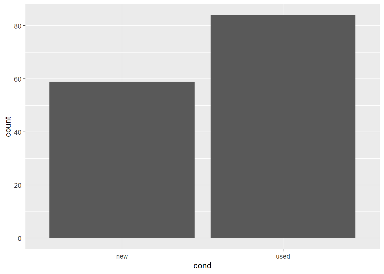
First, let’s explore the variable cond. Specifically, let’s investigate how many new games were sold versus how many used games were sold by creating a barplot. Add the following correct geom_*() to make a barplot of cond below.
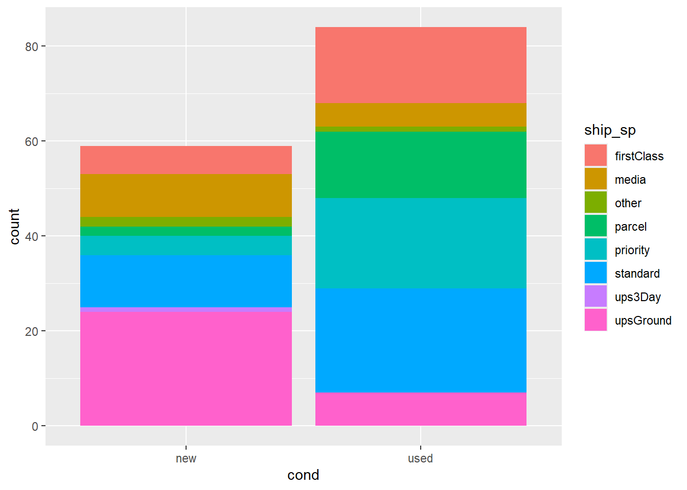
Next, let’s fill in the bars by the shipping method each game was shipped with ship_sp.
The code above uses fill to color the segments of the boxplot by another categorical variable. Below, we change fill to color. What happens? Why?
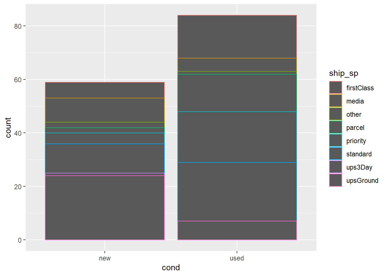
fill defines the color in which the geom is filled in with, while color defines the color in which the geom is outlined. A special exception to this is with scatterplots, where the dots are not treated as shapes to be filled in, and instead are filled in by color.
Count vs Proportion
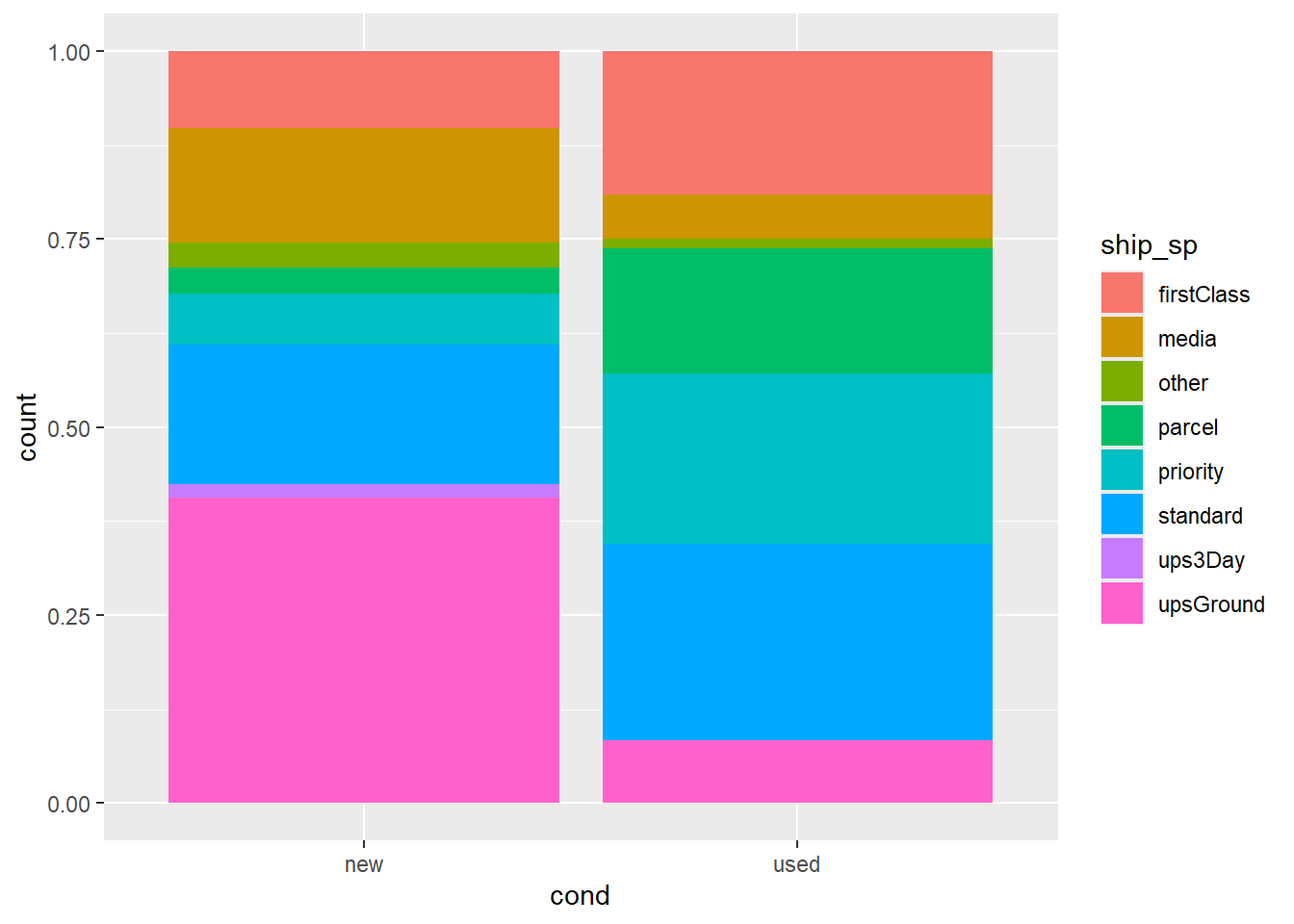
Up to this point, our bar plot has counted up the number of observations for each condition of game, and has been segmented by the count of shipping method. Perhaps it is easier to compare shipping method across condition of game if we looked at the proportion of shipping method within each game. This can be achieved using position = "fill" in the geom_xx() statement. Alter the code below so that it includes position = fill, and comment on the relationship between condition and shipping method.
Relationships between numerical and categorical variables
Up to this point, we have been visualizing the relationship between categorical variables. What if we wanted to look at the relationships between different types of variables?
Boxplots
One way we can investigate the relationship between different types of variables is to create a boxplot. Below, we are going to create a boxplot using geom_boxplot() between the variables cond and total_pr. What information can we gather from the boxplots?
  ggplot(
    mario,
    aes(x = cond, y = total_pr)
  ) +
    geom_boxplot()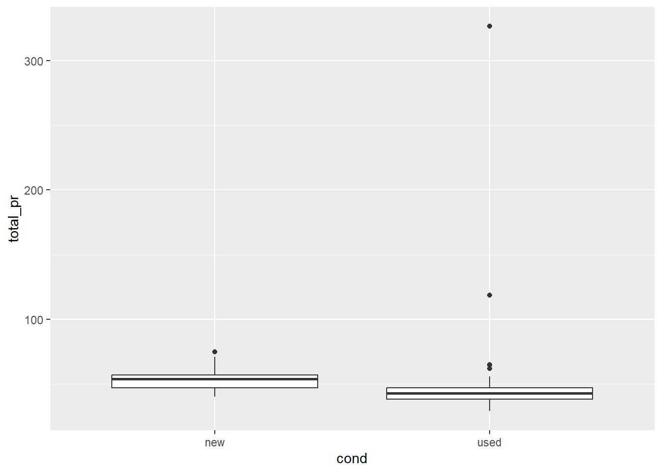
We can infer that the median total price for new Mario games is higher for the new condition versus the used condition. There appears to be one outlier in new condition, and four outliers in the used condition. The IQR of the new condition is slightly larger than the used condition.
Violin plot
A violin plot is a lot like a box plot, but also shows us information about the density of the quantitative variable. Below, we have a violin plot that again shows the relationship between the condition (cond) of the Mario game, and the total price (total_pr) of the game (cost + shipping). Describe the relationship below.
  ggplot(
    mario,
    aes(x = cond, y = total_pr)
  ) +
    geom_violin()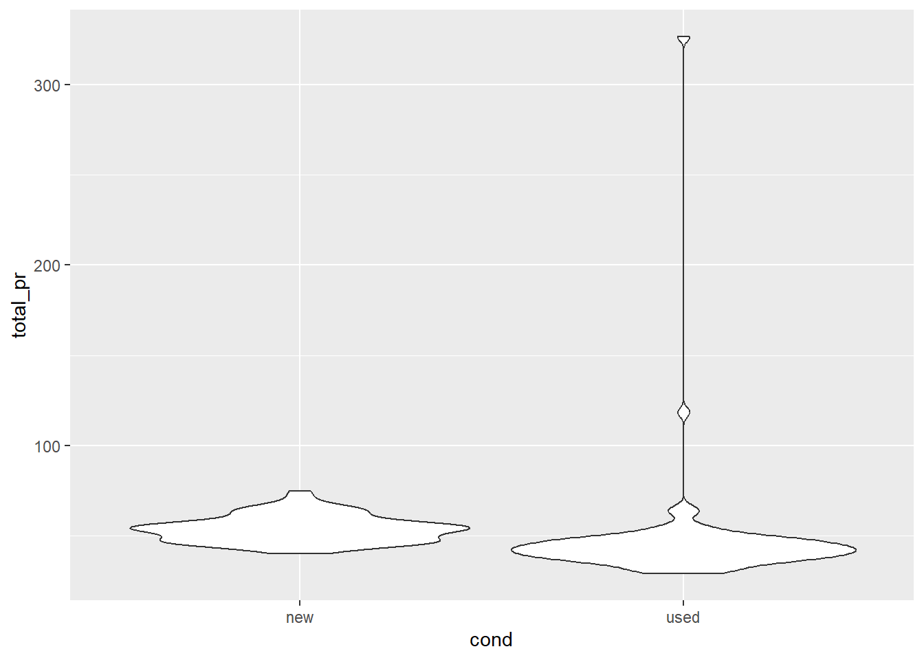
It appears that there is a higher density of new games at a higher price than used games. Used games appear to have two potential outliers higher than any new game.
Ridge plots
Ridge plots, similar to violin plots, shows the distribution of a numeric variable across the levels of a categorical variable. In order to make this plot, we will use geom_density_ridges(). Add this geom to the following code below to make the ridge plots. Within this geom, set alpha equal to 0.5.
  ggplot(
    mario,
    aes(x = total_pr, y = cond, fill = cond, color = cond)
  ) +
    geom_density_ridges(alpha = 0.5)
Picking joint bandwidth of 2.68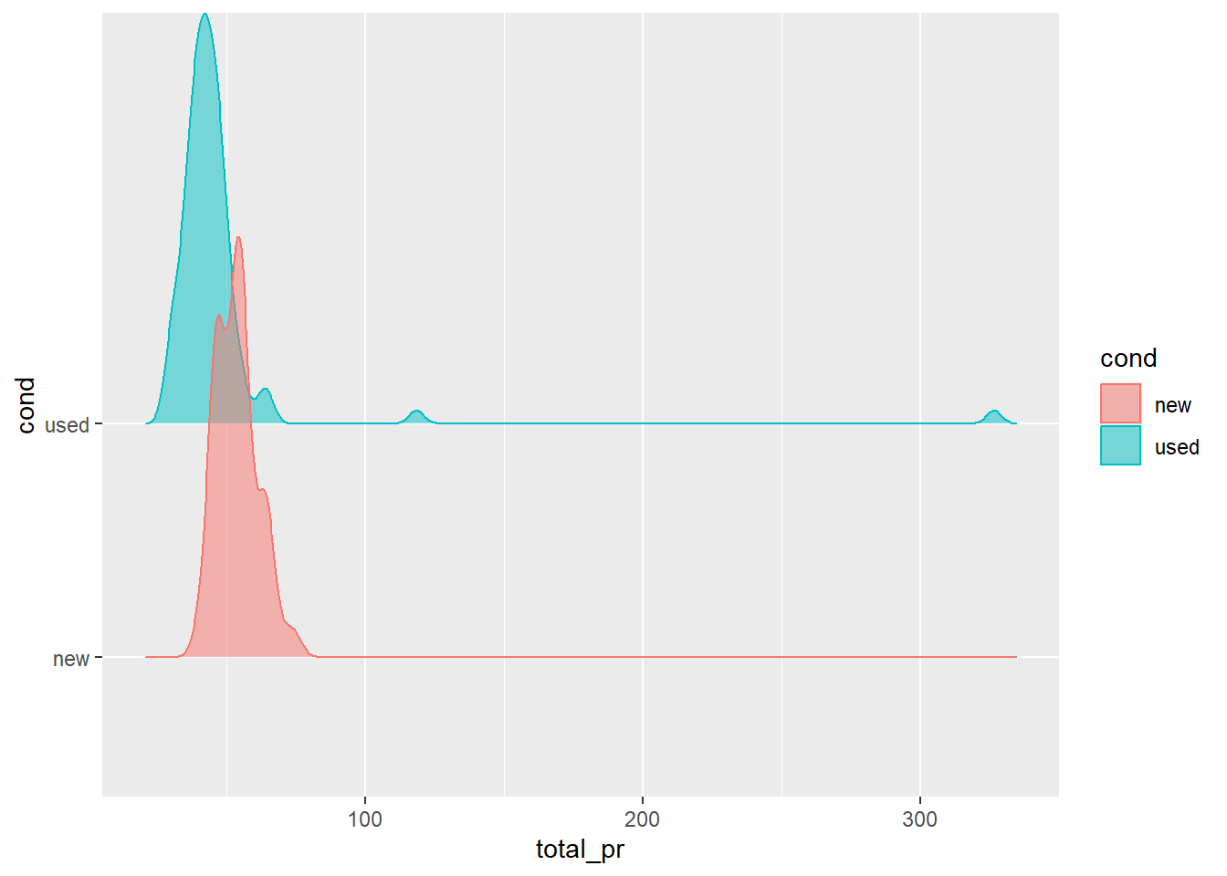
Working with dplyr
dplyr is a grammar of data manipulation that helps you work with data. We are going to explore the following dplyr verbs on the mario data set:
In this demonstration, we are going to explore if there is a difference in mean total price for a used game, if the game was sold with or without the stock photo. Let’s assume that we are only interested in new games.
select()
First, let’s use select to only select the columns of the data set we are interested in: total_pr, cond, and stock_photo.
mario |>
  select(total_pr, cond, stock_photo)
Note, you could also reference the column by position, or subtract out the other columns using either names or position.
mario |>
  select(4,7,10)
# A tibble: 143 × 3
cond total_pr stock_photo
<chr> <dbl> <chr>
1 new 51.6 yes
2 used 37.0 yes
3 new 45.5 no
4 new 44 yes
5 new 71 yes
6 new 45 yes
7 used 37.0 yes
8 new 54.0 yes
9 used 47 yes
10 used 50 no
# ℹ 133 more rows# A tibble: 143 × 3
cond total_pr stock_photo
<chr> <dbl> <chr>
1 new 51.6 yes
2 used 37.0 yes
3 new 45.5 no
4 new 44 yes
5 new 71 yes
6 new 45 yes
7 used 37.0 yes
8 new 54.0 yes
9 used 47 yes
10 used 50 no
# ℹ 133 more rowsfilter()
The function filter() acts on the rows of the data set, and subsets the data set based on a condition. Let’s add on to our code and use the filter() function to subset the data to only look at used games.
# A tibble: 84 × 3
total_pr cond stock_photo
<dbl> <chr> <chr>
1 37.0 used yes
2 37.0 used yes
3 47 used yes
4 50 used no
5 43.3 used yes
6 46 used yes
7 327. used no
8 31 used yes
9 46.5 used yes
10 34.5 used yes
# ℹ 74 more rows
group_by() and summarize()
Now that we have a subset of our data set that is relavent to our question of interest, we can calcualte the mean total price using group_by() and summarize(). Note that group_by() groups our data frame together by the specified variable so that we can calculate summary statistics (like the mean), at the group level instead of for the entire data frame using summarize(). Report which mean is higher. Is this the result you expected? Why or why not?
mario |>
  select(total_pr, cond, stock_photo) |>
filter(cond == "used") |>
group_by(stock_photo) |>
summarize(mean_pr = mean(total_pr))# A tibble: 2 × 2
stock_photo mean_pr
<chr> <dbl>
1 no 54.8
2 yes 42.0The mean total price is higher for a game that did not include a stock photo versus games that did. This is not what I expected, and would have expected that including a stock photo would have increased the price. This may be due to other variables in the data set not being accounted for in our calculations.
Extension: mutate()
The total price reported in our data set is in US dollars (USD). At the time of writing this exercise, the US exchange rate to Canadian currency (CAD) is 1.37. Suppose we wanted to answer the same question as above, but in CAD instead of USD. We can use mutate()to create a new cad_total_pr column before taking the mean cad_total_pr by stock photo. Recreate your table above, but in CAD.