Building a plot
step-by-step with ggplot2
Data visualization and transformation
ggplot2 \(\in\) tidyverse
-
ggplot2 is tidyverse’s data visualization package
gg in ggplot2 stands for Grammar of Graphics, inspired by the book Grammar of Graphics by Leland Wilkinson
Package website: ggplot2.tidyverse.org
-
Structure of the code for plots can be summarized as
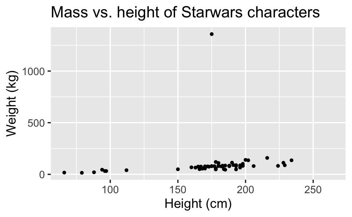
Mass vs. height
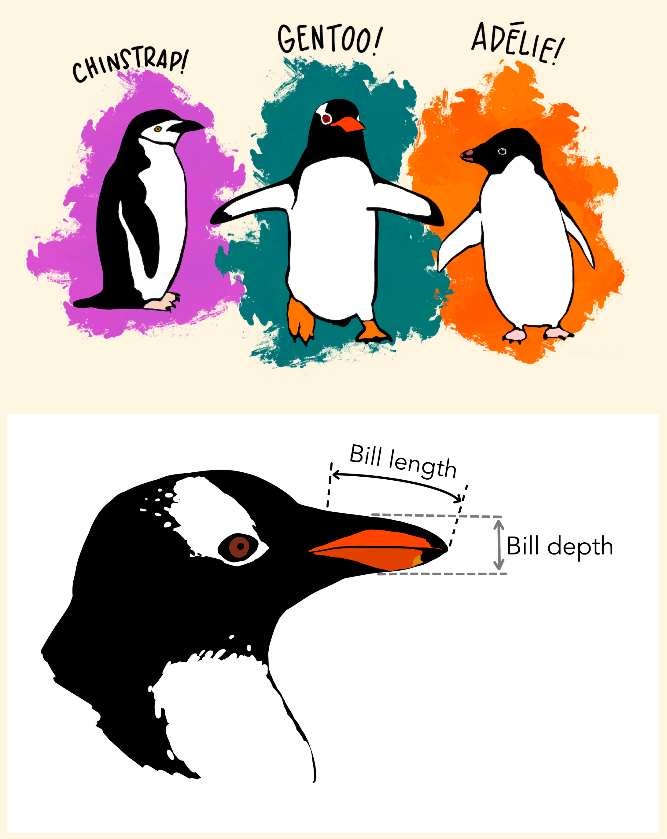
Data: Palmer Penguins
Measurements for penguin species, island in Palmer Archipelago, size (flipper length, body mass, bill dimensions), and sex.
Plot

Step 1
Start with the penguins data frame

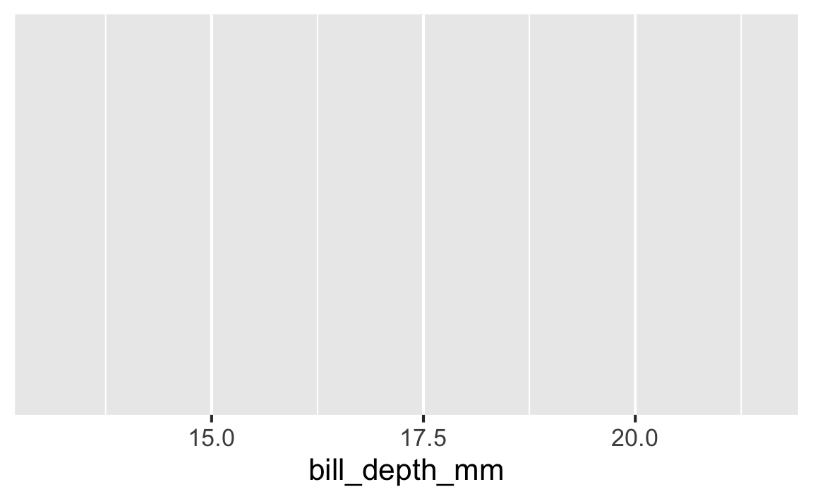
Step 2
Start with the penguins data frame, map bill depth to the x-axis
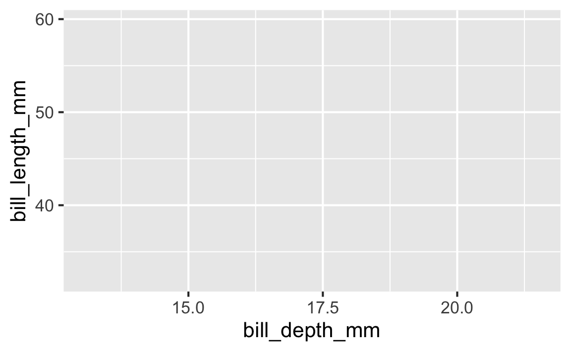
Step 3
Start with the penguins data frame, map bill depth to the x-axis and map bill length to the y-axis.
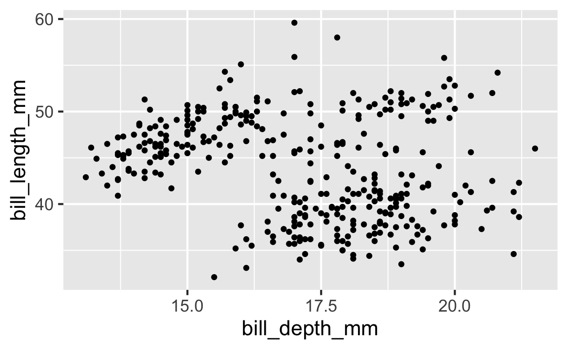
Step 4
Start with the penguins data frame, map bill depth to the x-axis and map bill length to the y-axis. Represent each observation with a point
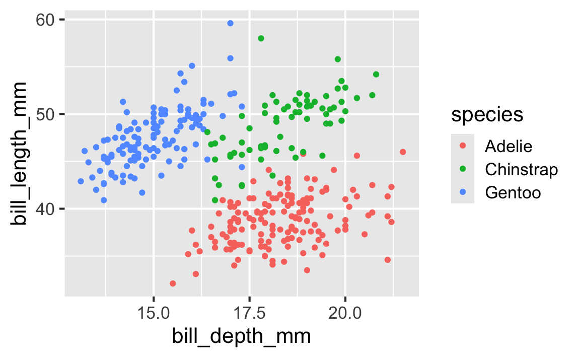
Step 5
Start with the penguins data frame, map bill depth to the x-axis and map bill length to the y-axis. Represent each observation with a point and map species to the color of each point.
Step 6
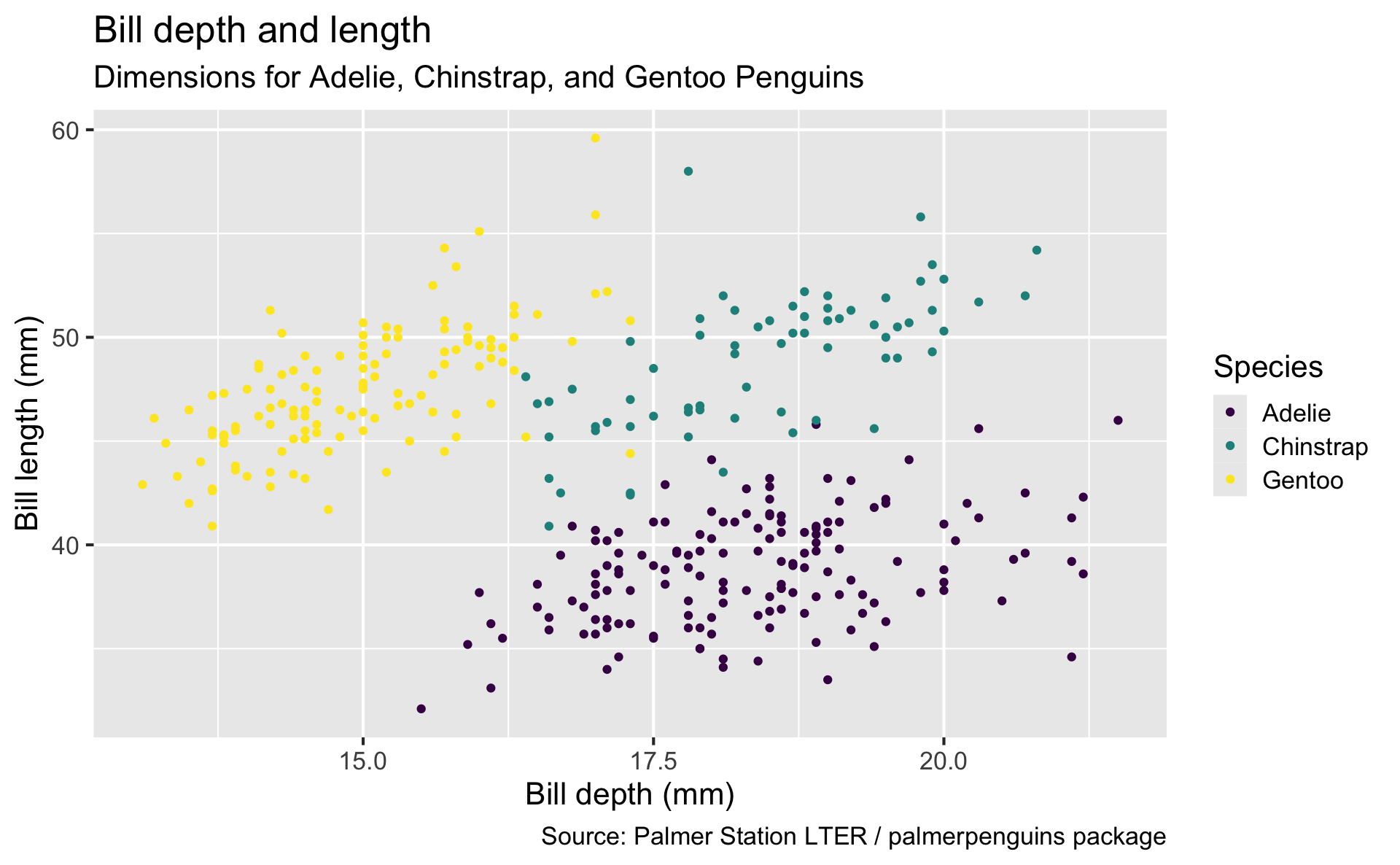
Start with the penguins data frame, map bill depth to the x-axis and map bill length to the y-axis. Represent each observation with a point and map species to the color of each point. Title the plot “Bill depth and length”
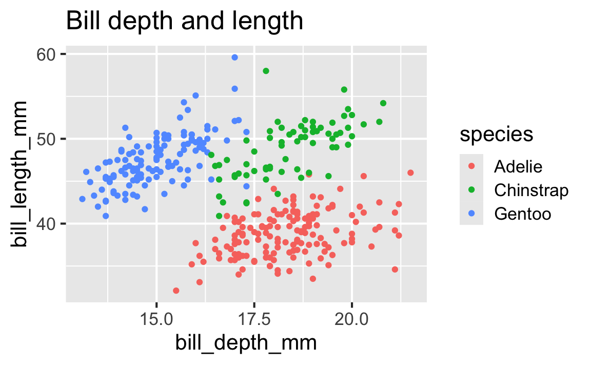
Step 7
Start with the penguins data frame, map bill depth to the x-axis and map bill length to the y-axis. Represent each observation with a point and map species to the color of each point. Title the plot “Bill depth and length”, add the subtitle “Dimensions for Adelie, Chinstrap, and Gentoo Penguins”

Step 8
Start with the penguins data frame, map bill depth to the x-axis and map bill length to the y-axis. Represent each observation with a point and map species to the color of each point. Title the plot “Bill depth and length”, add the subtitle “Dimensions for Adelie, Chinstrap, and Gentoo Penguins”, label the x and y axes as “Bill depth (mm)” and “Bill length (mm)”, respectively
Step 9
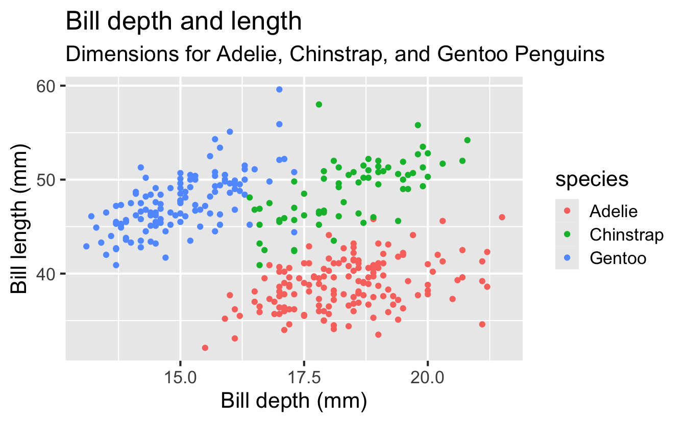
Start with the penguins data frame, map bill depth to the x-axis and map bill length to the y-axis. Represent each observation with a point and map species to the color of each point. Title the plot “Bill depth and length”, add the subtitle “Dimensions for Adelie, Chinstrap, and Gentoo Penguins”, label the x and y axes as “Bill depth (mm)” and “Bill length (mm)”, respectively, label the legend “Species”

Step 10
Start with the penguins data frame, map bill depth to the x-axis and map bill length to the y-axis. Represent each observation with a point and map species to the color of each point. Title the plot “Bill depth and length”, add the subtitle “Dimensions for Adelie, Chinstrap, and Gentoo Penguins”, label the x and y axes as “Bill depth (mm)” and “Bill length (mm)”, respectively, label the legend “Species”, and add a caption for the data source.
ggplot(
data = penguins,
mapping = aes(x = bill_depth_mm, y = bill_length_mm, color = species)
) +
geom_point() +
labs(
title = "Bill depth and length",
subtitle = "Dimensions for Adelie, Chinstrap, and Gentoo Penguins",
x = "Bill depth (mm)", y = "Bill length (mm)",
color = "Species",
caption = "Source: Palmer Station LTER / palmerpenguins package"
)
Step 11
Start with the penguins data frame, map bill depth to the x-axis and map bill length to the y-axis. Represent each observation with a point and map species to the color of each point. Title the plot “Bill depth and length”, add the subtitle “Dimensions for Adelie, Chinstrap, and Gentoo Penguins”, label the x and y axes as “Bill depth (mm)” and “Bill length (mm)”, respectively, label the legend “Species”, and add a caption for the data source. Finally, use a discrete color scale that is designed to be perceived by viewers with common forms of color blindness.
ggplot(
data = penguins,
mapping = aes(x = bill_depth_mm, y = bill_length_mm, color = species)
) +
geom_point() +
labs(
title = "Bill depth and length",
subtitle = "Dimensions for Adelie, Chinstrap, and Gentoo Penguins",
x = "Bill depth (mm)", y = "Bill length (mm)",
color = "Species",
caption = "Source: Palmer Station LTER / palmerpenguins package"
) +
scale_color_viridis_d()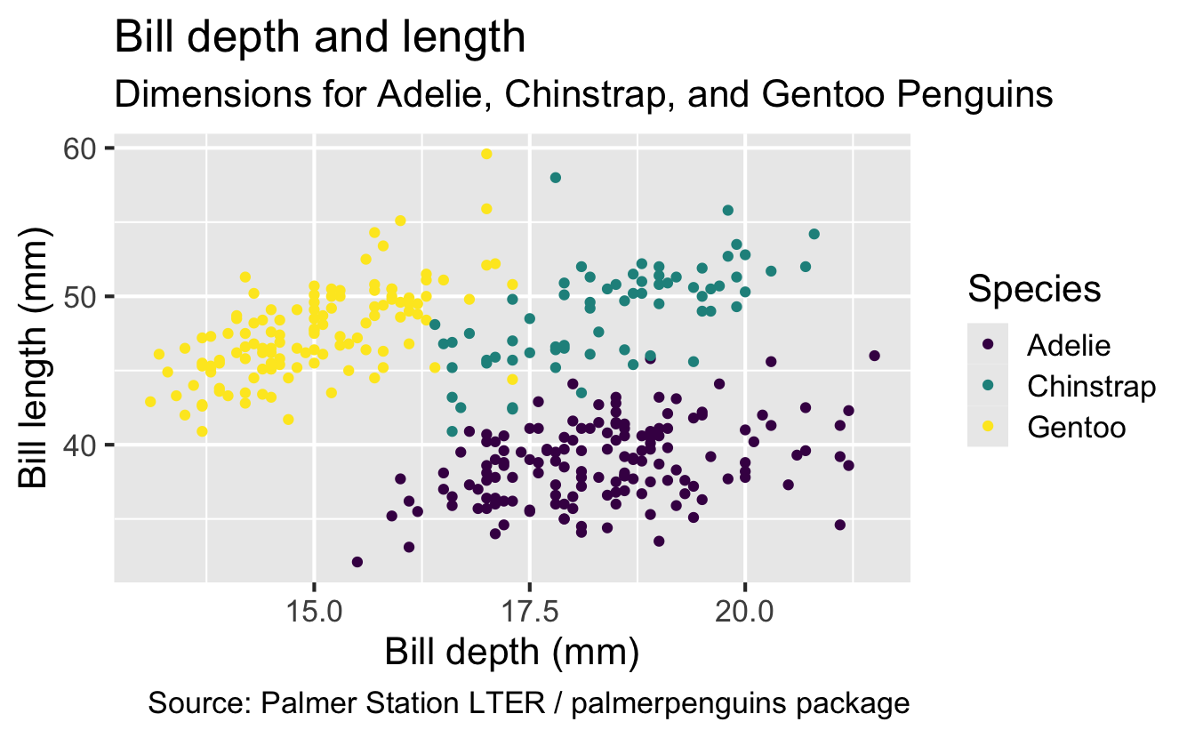
Plot
Warning: Removed 2 rows containing missing values or values outside
the scale range (`geom_point()`).